years of
experience
projects
Ideas and solutions in the
form of unique projects that inspires people.

payever
product lead / design lead / product design

imua
product management / product design / concept

o boticario
product strategy / product design / branding
caixa
product design / design system / content design

saas tool design
product design / design system
restaurant app
product design / branding / ux/ui
kid's streaming app
product design / branding / ux/ui / app
timer camera app
product design / branding / ux/ui / app

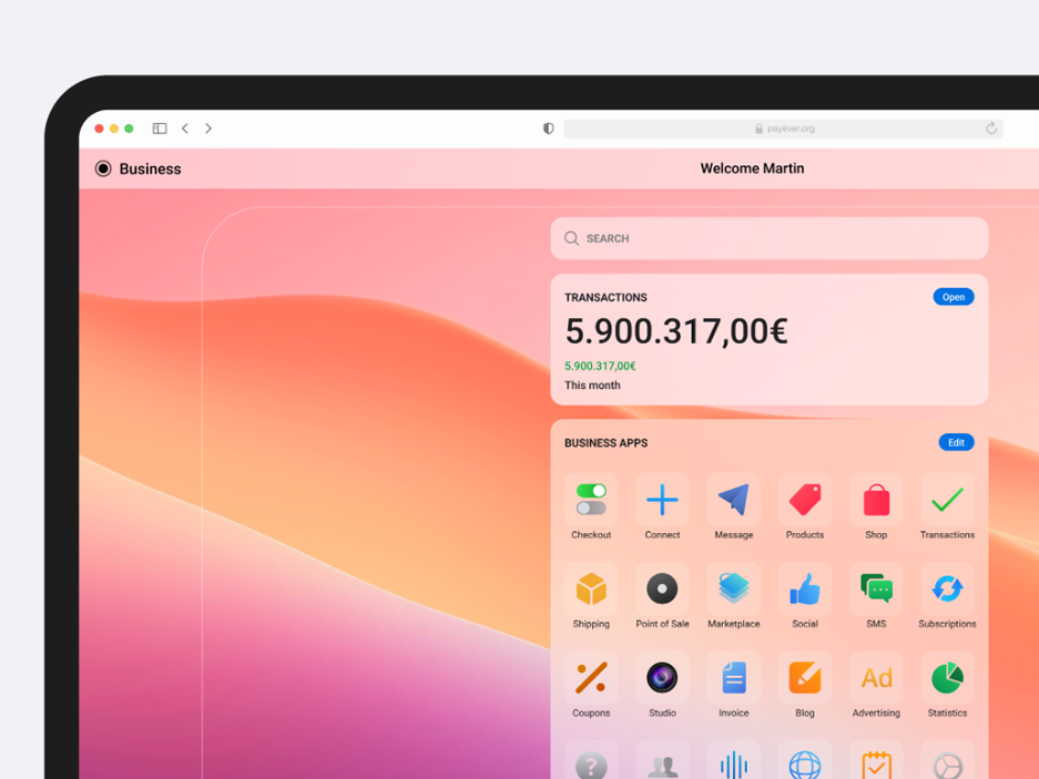
payever
payever is building the commerce infrastructure to connect businesses of any size & industry with its partners and accept payments online & at the Point of Sale - easier, faster and more secure.
category
product management / design lead / product design /
client
payever GmbH
start Date
august 03, 2021
status
ongoing


project description
This is one of the many products we've been creating and improving over the years. Payever's Checkout Solutions aim to streamline payment processes for businesses, enhancing user experience and conversion rates.
the challenge
We faced the following problems:
Complex Integrations: Businesses often encounter difficulties integrating multiple payment options seamlessly into their platforms.
Cart Abandonment: Lengthy or complicated checkout processes can lead to increased cart abandonment rates.
Brand Consistency: Maintaining a consistent brand experience throughout the checkout process is challenging when using third-party payment gateways.Proposed Solutions:
Composable Checkout: Payever offers express checkout widgets and rate calculators that can be strategically placed on product pages, shopping carts, or directly in the checkout. This approach reduces the steps required for payment, keeping customers engaged and minimizing redirects.
Diverse Payment Options: The platform supports various payment methods, including Buy Now Pay Later (BNPL) for both B2C and B2B, financing, open banking, cards, and wallets, catering to diverse customer preferences.
Checkout Customization: Businesses can tailor the checkout interface to align with their brand's colors, fonts, and styles, ensuring a cohesive brand experience.
UX/UI Approach:
User-Centric Design: The checkout process is designed to be intuitive, minimizing the number of steps and information required from the user, thereby reducing friction.
Responsive Design: Ensuring compatibility across various devices and platforms to provide a seamless experience for all users.
Trust Signals: Incorporating security badges and clear policies within the checkout process to build user trust and confidence.
Personas:
Entrepreneurs:
Needs: A straightforward integration of multiple payment options to cater to a broad customer base.
Pain Points: Technical challenges in integrating payment systems and maintaining a consistent brand experience.
Goals: Increase conversion rates and provide a seamless checkout experience to customers.
Small to Medium-Sized Retailers:
Needs: Affordable and customizable checkout solutions that can scale with business growth.
Pain Points: Limited resources to manage complex integrations and the need to offer diverse payment methods.
Goals: Enhance customer satisfaction and reduce cart abandonment rates.
Tech-Savvy Consumers:
Needs: Quick, secure, and flexible payment options during online shopping.
Pain Points: Frustration with lengthy checkout processes and lack of preferred payment methods.
Goals: Complete purchases efficiently with their chosen payment method.
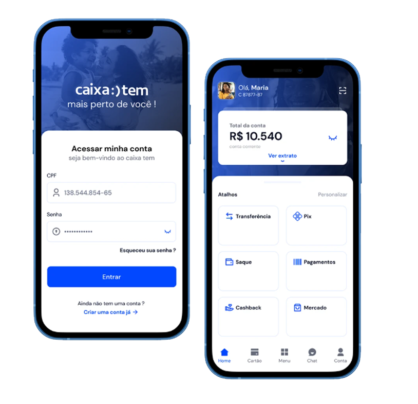
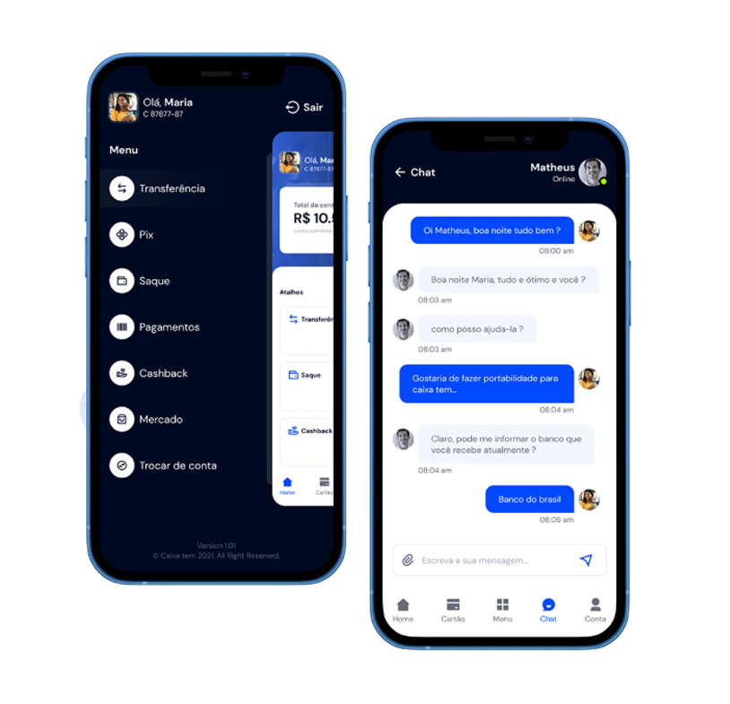
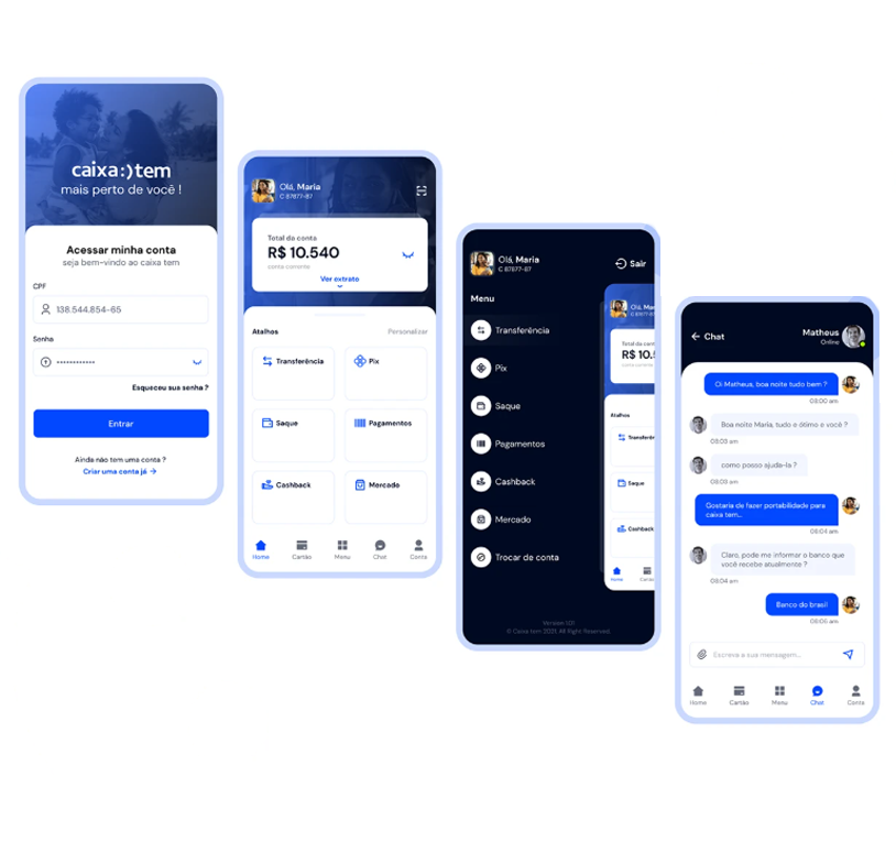
caixa
The project centers on the development and delivery of a new credit platform at CAIXA, Brazil’s federal savings bank. It's a large-scale digital transformation initiative involving multiple squads and professionals from UX, development, and business areas. The focus is on redesigning and expanding CAIXA’s digital ecosystem for Crédito Consignado (payroll-deductible loans), across both internal and external customer channels.
category
design lead / product design / content design
client
CAIXA
start Date
april 28, 2024
status
ongoing
project objectives
- Create a new, modular, scalable credit platform to support current and future loan operations.
- Improve UX across all user journeys (from simulation to post-sale).
- Integrate various systems (legacy and new) for a seamless product lifecycle.
- Modernize the Novo App CAIXA and Plataforma.CAIXA, especially for credit features.
the challenge
- Modernize legacy systems and unify workflows across internal and external credit operations.
- Standardize user experiences across platforms like Novo App CAIXA and Plataforma.CAIXA.
- Coordinate delivery across 11 cross-functional squads with distinct scopes.
- Develop a scalable and reusable design system (DSC & Lib CAIXA).
- Manage a critical contract migration roadmap with tight deadlines.
- Align discovery insights with technical feasibility and business needs.
Proposed Solutions:
Modular Squad Architecture:
Each of the 11 squads is dedicated to a specific business domain (e.g., Contracts, Parameters, Discovery), enabling focus, autonomy, and specialized delivery across different areas of the credit journey.
Dedicated UX Structure with Embedded Designers:
UX Designers are embedded in each squad, supported by a centralized Design System (DS) team and a Discovery team. This ensures consistency, design alignment, and user-centered decision-making from research to delivery.
Scalable Design System (DSC & Lib CAIXA+):
A shared design system library supports all squads with reusable components, patterns, and documentation—reducing redundancy and ensuring visual and interaction coherence across platforms.
Compass Framework for Alignment:
The project uses Compass (likely an internal alignment and governance tool) to manage cross-squad communication, status tracking, and project cadence, ensuring teams remain in sync across delivery phases.
Phased Delivery with Clear Milestones:
The roadmap breaks the work into manageable phases: initial functionalities, complementary features, and contract migrations. This phased structure helps de-risk delivery and provides checkpoints for validation.
Discovery-Driven Approach:
Early user research and journey mapping help squads validate needs and behaviors before development, reducing rework and enhancing usability for both customers and internal agents.
UX/UI Approach:
Embedded UX in All Squads:
UX Designers are fully integrated into each of the 11 squads, ensuring user experience is considered at every step of product development—from contracts and channels to accounting and post-sale journeys.
Discovery-First Mindset:
A dedicated Discovery team conducts early research, journey mapping, and problem framing to inform product decisions with real user needs—before solutions are proposed or built.
Design System Governance (DSC & Lib CAIXA):
A core DS team supports all designers with a unified component library and design guidelines. This ensures consistency, speeds up delivery, and reduces design debt across platforms.
Omnichannel Consistency:
The UI strategy focuses on delivering seamless and familiar interfaces across Novo App CAIXA, Plataforma.CAIXA, and internal tools—balancing accessibility, clarity, and efficiency.
Compass as Alignment Tool:
UX deliverables are aligned via the Compass framework, creating visibility across squads and fostering shared ownership of user journeys and interface decisions.
Progressive Validation and Handoff:
Design handoffs are done incrementally, with user journeys validated as they evolve. Close collaboration with developers ensures interfaces remain faithful to the intended experience.
Content Design:
UX Writing Integrated into Product Teams:
Content design is embedded within the Design System squad, with dedicated UX Writers collaborating closely with designers and developers to ensure clarity, consistency, and accessibility in all user interfaces.
Clarity in Complex Financial Journeys:
Given the intricacies of credit simulations, contract migrations, and financial operations, content design focuses on simplifying technical language, reducing user confusion, and guiding users with action-oriented and inclusive microcopy.
Design System Language Standards:
The DSC & Lib CAIXA provides not only visual components but also content guidelines and language principles, ensuring tone, vocabulary, and information hierarchy are standardized across all squads and platforms.
Microcopy as UX Strategy:
Every label, button, tooltip, and error message is treated as a touchpoint. The content strategy avoids jargon, emphasizes user intent, and works in tandem with interface behavior to enhance usability.

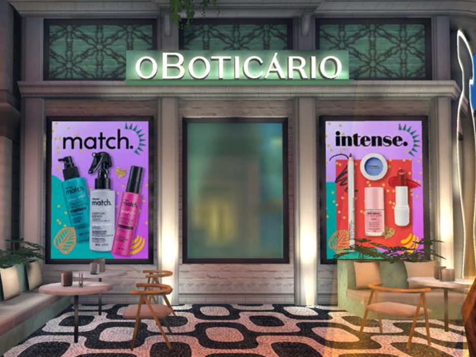
boti metaverse
In the Avakin Life universe, participants could choose different items, decorate apartments, virtually visit real or fantasy locations, as well as chat and compete with other players.
category
product strategy / product design / branding
client
almapBBDO
start date
september 01, 2021
status
completed


project description
O Boticário has created an in-game experience that allows users to create their own avatars in the virtual reality game, Avakin Life.
The project, conceived by the brand in partnership with BBL and the agency AlmapBBDO (with which I sometimes work as a creative consultant), was active between February 22 and March 5, 2022 and unfolded into two virtual Carnival blocks, which were named after Boticário brands in the makeup and hair categories: "Intense Block" and "Match Block".
the challenge
The carnival action and the reactivation of the store in the game was a step by Boticário in its strategy to expand dialogue and promote differentiated experiences that connect the in and out-of-game world with the most diverse audiences.
Brands need to be where our consumers are. Today, we already have an analytical and data-driven mindset. There is a need to understand this audience in depth, actively listening to the community and, based on this listening, connecting brands with relevant language, products and services, linking the audience to a personalized strategy. Companies cannot talk about the evolution and construction of the future of any business and communication without being connected with gamers.
the approach
During the period, the game presented some activations and missions to engage and provide benefits to players. In Beauty Quest, participants were invited to complete a series of challenges about the world of beauty. Upon completing the tasks, they were awarded BotiCoins.
In Fashion Contest, players participated in beauty contests with Boticário products, and the best “looks” received points. The rewards could be used in the brand’s store, within the game. At the end of the season, the brand held a Pool Party, a personalized pool party open to all users of the game.
my contributions
With extensive experience in branding, product creation and digital platforms, I worked as a creative leader, strategic designer and creative consultant. I developed strategic objectives based on the needs of the brand and target audiences and led the creative development team.

SaaS Tool Design
This newly founded startup wanted to support organizations and teams in the design, control and optimization of their work.
category
product leader / product design / design System
client
confidential - hamburg - GmbH
start date
april, 2023
status
completed


project overview
The tool aimed to be an intelligent companion in setting up highly efficient organization structures to tackle overhead and lacks of transparency.
the challenge
Designing a product that didn't exist before was quite a challenge and I and the founder didn't know if the concept was design and buildable.
the solution
In several iterations, the key functionalities of the product were explored and the behaviors defined while a small development team built the first proof of concept.
designing with components
Right from the start a design system was set up in Figma to easily apply changes throughout the process and to keep things highly consistent throughout the app.
spreading the word
With Webflow, a lean landing page was designed and built to get the first beta testers on board and to attract potential investors.
Result
The product received a lot of attention in the European startup scene and got the first funding soon after the beta was released.

IMUA
IMUA is a beautiful project that was created to put a Human Resources methodology in a systemic flow.
category
product management / product design / design lead
client
flow executive finders
start date
august 20, 2021
status
ongoing


project overview
The project was built on three great pillars. People, companies and projects. The greatness of it is to see the Data Intelligence connect it all.
the challenge
One of the great challenges in job recruitment is matching candidates to roles effectively. Achieving this requires navigating through a large pool of applicants, assessing diverse skills, and ensuring cultural fit. Balancing automation with personalization is crucial to streamline the process and enhance the overall candidate experience. Designing a product that didn't exist before was quite a challenge and I and the founder didn't know if the concept was design and buildable.
my contributions
For this project I was initially responsible for all product design tasks. This included researching, defining personas, creating flowcharts and wireframes as well as designing a finished user interface. Later I was responsible for all definitions by the Product team alongside P.O.s, UX/UI designers and data product specialists.

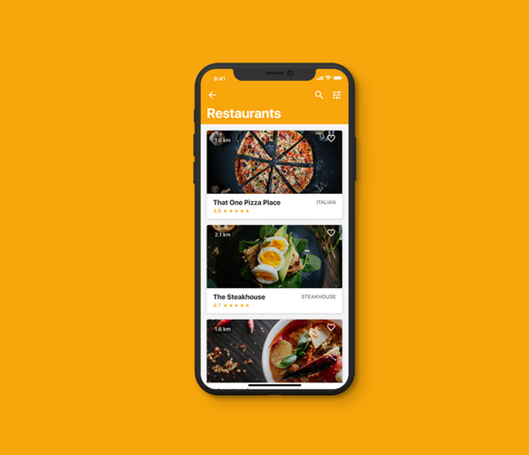
project restaurant
This app (name excluded for now) is meant to help the users find deals at local restaurants. Even though this sounds simple there are a lot of little steps involved in filtering, sorting and displaying different items, so the goal of the project was to design each of the steps so they form a pleasant experience for the user.
category
product design / design ops
client
confidential
start date
may 05, 2024
status
completed/not yet lauched


my contributions
I was originally brought to this project as a consultant to help guide the design decisions of the firm the client had already hired. After I created a couple of proposed designs for the main screens of the app the client decided that I should take over the majority of the work so I was tasked with leading the design of the full app.
workflow
Going into this engagement, the client was definitely in need of some major help with this mobile app's UI/UX. The team (10 people) helped dramatically in the feat going above and beyond in providing alternative suggestions and feedback to the pre-existing ideas. We initially started off with a few screens that needed work, but after seeing the quality and attention to detail of the ongoing work, we decided to extend to redesign the entire application.
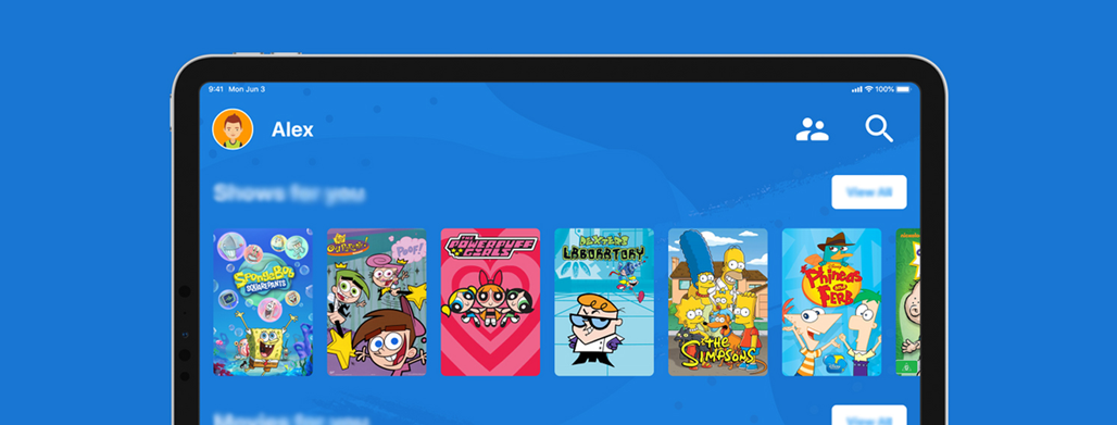
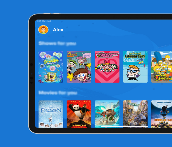
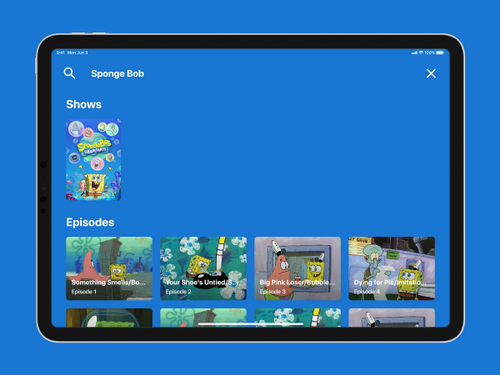
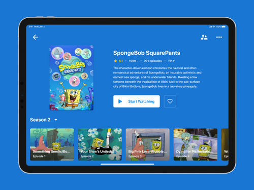
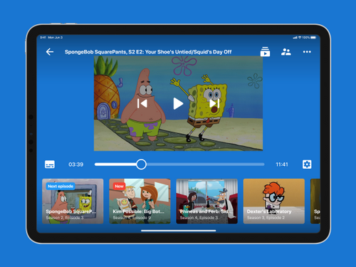
kid's streaming app
The goal of the project was to design a tablet app concept where children from the ages from 6 to 14 can stream their favorite TV and movie content.
category
product design / branding / UX-UI
client
confidential
start date
april, 2023
status
completed
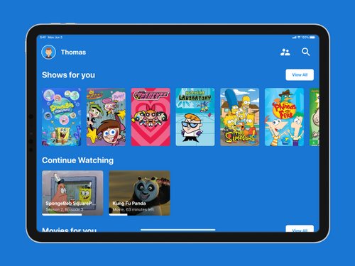
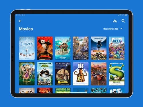
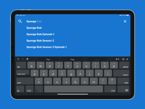
my contributions
I was responsible for this project from start to finish. This included doing research, defining personas, creating flowcharts and wireframes as well as designing a finished user interface.
User research on a $0 budget
For this project I didn't have a budget I could spend on research but because of a very specific target audience of this app I knew I can't skip this step. Thankfully there were studies that others have done. Nielsen Norman Group had two studies, one about kids and one about teens, and the summary with most important findings was available for free on their website. Here are some interesting things I learned:
"We recommend at least 2cm × 2cm touch targets for young children (4 times bigger
than the 1cm x 1cm recommended target size for adult users)."
— Nielsen Norman Group, Design for Kids Based on Their Stage of Physical Development
"Some websites in our study tried to serve both children and teens in a single area, usually titled Kids. A grave mistake: the word “kid” is a teen repellent. Teenagers are fiercely proud of their newly won status, and they don’t want overly childish content."
— Nielsen Norman Group, Teenager’s UX: Designing for Teens
Conducting interviews
After going through the NNg studies I decided to go a bit deeper and talk to some users. First I interviewed a couple of teachers and parents. What I learned from a teacher who works with kids aged 6-10 is that they know how to use a smartphone and are comfortable with using the search function to find their favorite YouTubers. I also learned that most of them don't own their smartphone so using a tablet for streaming is a likely scenario.
Conducting a field studys
I also observed several kids while they used their streaming app of choice - in most cases this was YouTube. I confirmed that by the age of 3 kids can use YouTube mobile app and are familiar with how it works but they do have trouble hitting adult sized (read: smaller) tap targets.
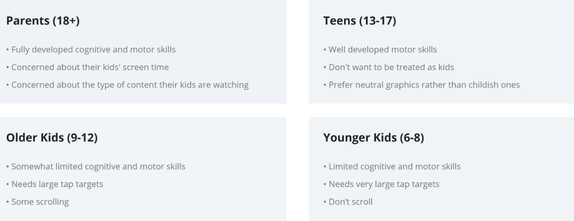
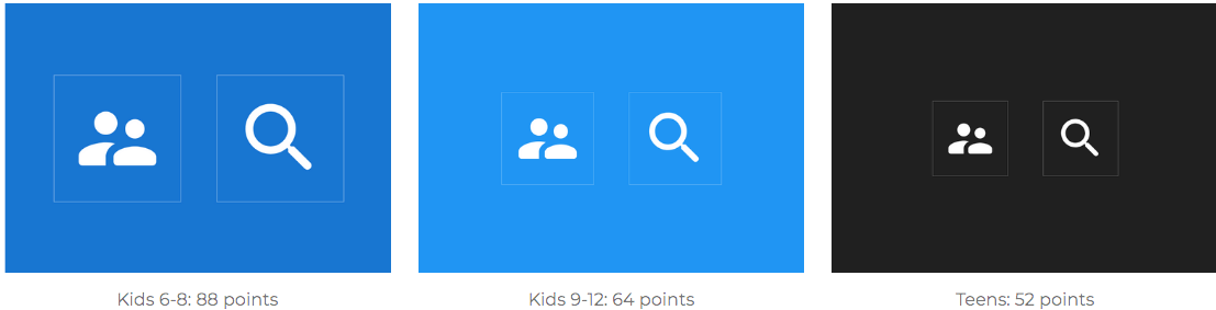
Defining the user categories
Based on the research I defined four different user groups based on their needs and stages of physical and cognitive development. These are Parents (18+), Teens (13-17), Older kids (9-12) and Younger kids (6-8).
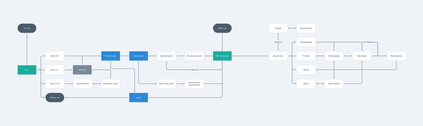
Defining the flow
After that I proceeded with creating a flowchart showing how the app would be organized. The main takeaway are the separate flows for each user category.
Wireframing: Onboarding
After I was done with all the planning I moved on to wireframing and I started with the onboarding flow.
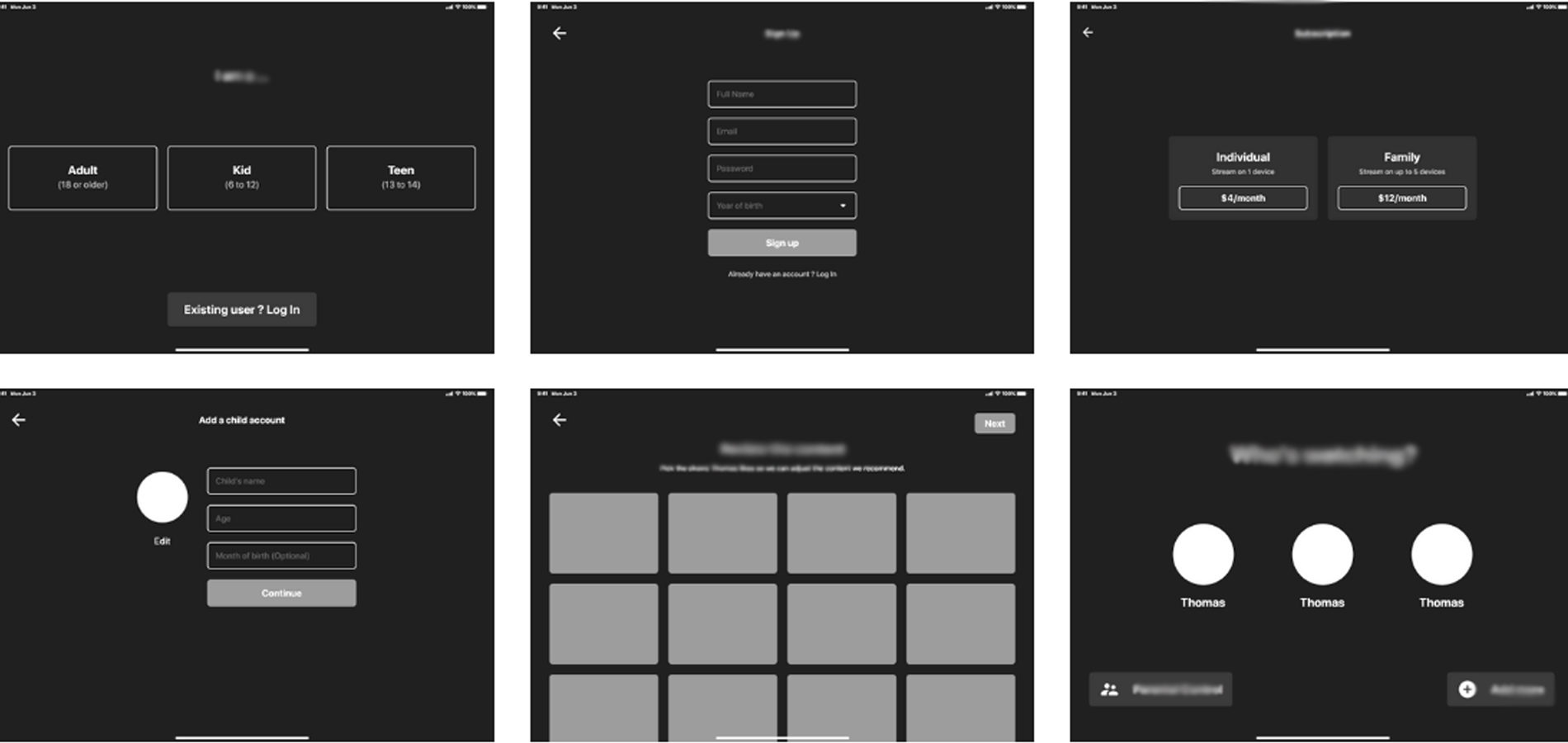
Wireframing: Separate flows
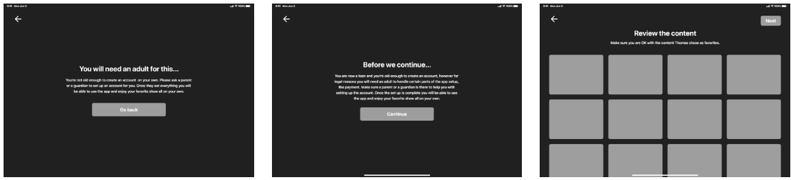
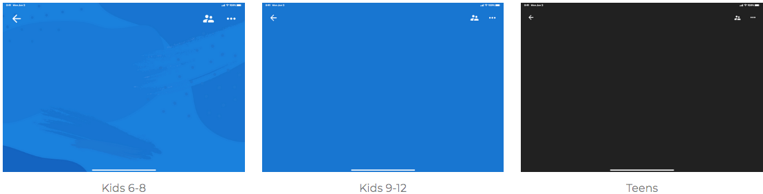
As the flow I defined earlier contains separate flow for each user category I wireframed them as well. After the first step (shown in the previous set) teens and kids get a message letting them know if they will need a parent to help them set up the app.
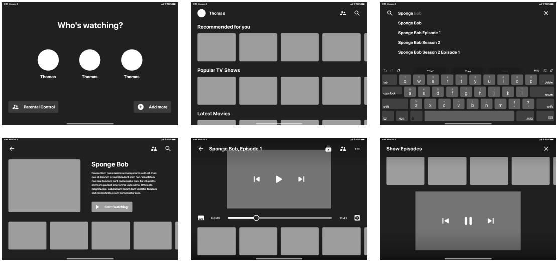
Wireframing: Main flow
After I took care of the onboarding screens I moved on to wireframing the main flow. Since the research showed the kids are already familiar with how other apps (especially YouTube) work I decided to stick with the common interaction patterns.
User Interface: Tap Targets
Research shows that kids require a tap area 4 times larger than those suitable for adults (2x2cm vs 1x1cm) so I made sure to increase the size of all targets. Also, since the age range of target user is pretty wide I decided to make the interface grow with them, starting with the biggest tap targets and progressing to regular sized ones as the kids grow and develop their motors skills.
User Interface: Backgrounds
Research also identified that as kids grow and become teens they no longer want to be treated like kids and the content targeted at them shouldn't be too childish. That's why the interface changes in this regards as well becoming less childish and colorful as the kids grow.
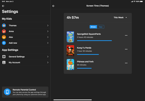
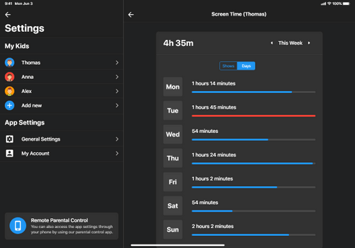
Parental controls
Since most parents are concerned with how much time their kids spend in front of the screen, the app includes parental controls that let's parents monitor and control their kids screen time.
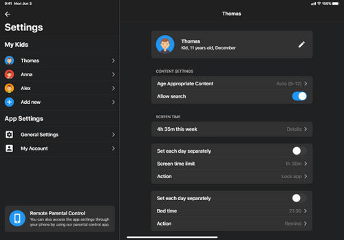
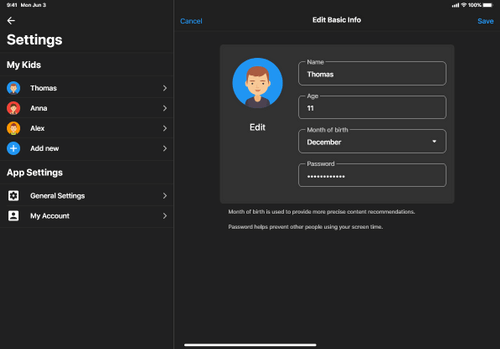
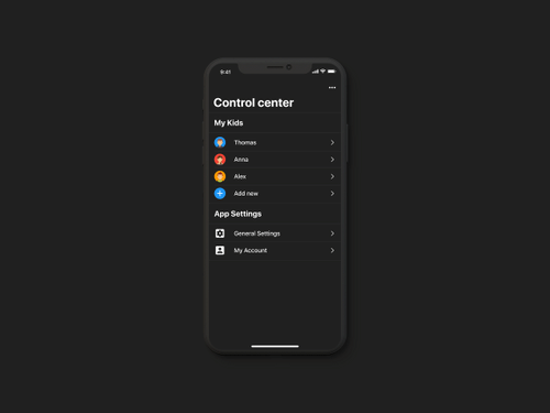
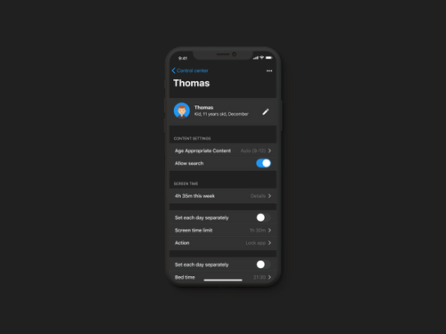
Remote parental controls
There is also a mobile companion app that let's parent control and monitor what their kids are watching without interrupting their experience. This also allows kids feel like they have more freedom which is especially important in case of teens.
Final UI
After everything else was complete I proceeded with designing the remaining screens - most of them in 3 different versions for different user categories.
about
I will help put your ideas, goals and needs in the
form unique projects that inspires you
and you customers.
beyond
the obvious
I’m Deborah Magnani — a creative technologist, product designer, and researcher with a Ph.D. in Computing Arts and Design. My work bridges design, technology, art, and strategy to build intuitive digital products and immersive experiences that go beyond the obvious.
Over the past two decades, I’ve led design teams and shaped product strategies across startups, creative agencies, and global SaaS platforms. I specialize in transforming complex technologies—like AI and emerging digital realities—into human-centered, innovative solutions.
Beyond industry, I’m also a dedicated professor and mentor, developing and teaching courses in UX, digital design, media theory, and creative technologies. I believe design is a powerful tool for transformation and empowerment, and I’m passionate about sharing knowledge to help shape the next generation of creative leaders.
creative process
Let’s connect and explore how creativity and technology can shape new possibilities together.
- Blending AI, immersive tech, and UX
- Crafting innovative data-driven products
- Working with multidisciplinary teams
- Transforming complexity into simplicity
- Educating and mentoring
- Driven by curiosity & innovation
CLIENTS
Unique ideas, for unique companies.
experience
education
skills
knowledge is love and light and vision. wisdom is knowing what to do next.
virtue is doing it. skill is knowing how to do it.
92%
figma
89%
adobe cc
85%
miro
85%
agile
80%
sketch
90%
xd
let's talk
about design

user experience excels when we break down problems to create solutions that connect people with integrity and focus
0+
0+
projects
completed
completed
0+
study
years
years
0
movies
watched =)
watched =)